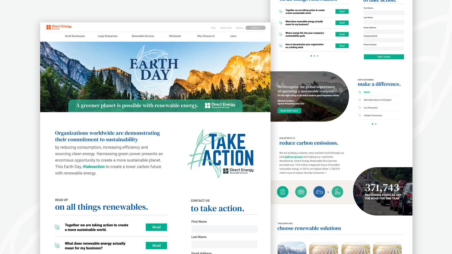
A new initiative was launched to showcase the company customer success stories on the Direct Energy Business website as well as on the walls throughout the offices. The website needed a refresh from a user experience point of view, so I worked directly with the UX team to implement a new layout that was more approachable, dynamic and easy to navigate. To solve for the large quantity of stories that were required to be on the page, I introduced a grid layout to organize them in a more digestible format, as well as balancing the use of vibrant imagery and white space to keep it a clean experience.
User Experience before the redesign:
User Experience after the redesign. View the live version here.
I then had to translate the branding of the updated Energy All-Star campaign into floor to ceiling wall graphics to be installed in the office hallways. Here I was able to highlighting customer photography as well as their strategy, footprint and a quote in a clean, cohesive way.

